Bubble Plots in R with Plotly
Introduction
Bubble Plots are an effective way of displaying data over and was used effectively by Hans Rosling in his famous TED Talk. Bubble plots are able to display multiple dimensions of data in an understandable manner. A bubble plot displays the relation ship between 2 continuous variables, like a scatter plot. However a third continuous variable comes into play, via the radius of each bubble. A fourth categorical variable can be added, using different colors for different categories. Given that the bubbles tend to overlap, transparency is usually increased. A fifth dimension, time, comes into play when a series of bubble plots are strung together to create an animation, producing a captivating display as seen in the TED talk.
Data
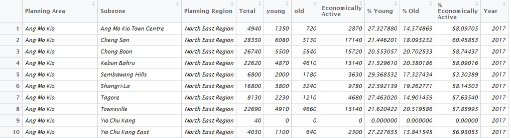
We will use the Singapore population data available from Singstat. Population data in the various residential subzones, planning areas and planning regions are available from 2002 to 2017. Singstat breaks down the population by 5 year cohorts; 0-4 years old, 5-9 years old, and so forth. For our analysis we will group the population into young (0-24 years old), economically active (25-64 years old) and old (65 years and above). Here is the header of our table
Bubble Plot
Plotly is a great visualization library has a step by step tutorial to produce bubble plots. Plotly’s syntax is similar to ggplot2. In this visualization, we represent the % Young on the x-axis and the % Economically Active on the y-axis for each planning subzone. The data is restricted to 2017 for a static bubble plot. The total population will be represented by the size of the bubble. Given the number of subzones and planning areas, coloring by either parameter will require too many colors and only results in confusion. Instead we color using the 5 planning areas and use the color scheme used in the plotly bubble chart tutorial.
library(tidyverse)
library(plotly)

# We filter for 2017 for a static display
pop2017<-pop %>% filter(Year=='2017')

# We reuse the color scheme from the plotly website
colors <- c('#4AC6B7', '#1972A4', '#965F8A', '#FF7070', '#C61951')

# Using Plotly
r1 <- plot_ly(
  pop2017, x = ~`% Young`, y = ~`% Economically Active`,
  color = ~`Planning Region`, type = "scatter",
  mode="markers", colors=~colors, size=~`Total`,
  marker = list(symbol = 'circle', sizemode = 'diameter',
                      line = list(width = 2, color = '#FFFFFF'), opacity=0.4)

  )
r1
Here is a snapshot of the code output:
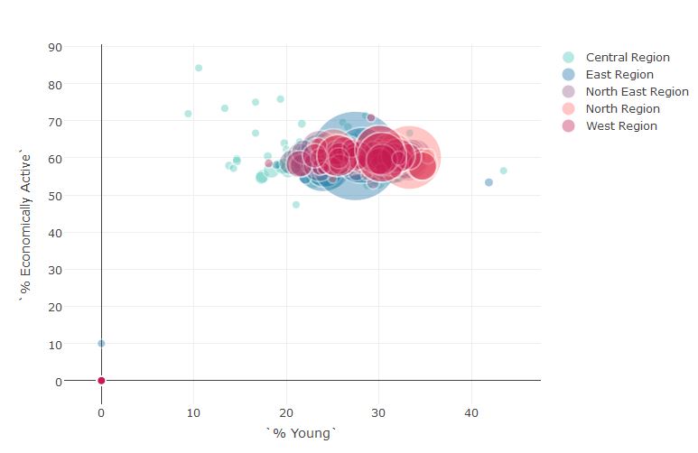
We can improve the plot by adding the title, axis labels and enabling the tip to display the subzone information when the mouse hovers over it
r2 <- plot_ly(
  pop2017, x = ~`% Young`, y = ~`% Economically Active`,
  color = ~`Planning Region`, type = "scatter",
  mode="markers", colors=~colors, size=~`Total`,
  marker = list(symbol = 'circle', sizemode = 'diameter',
                      line = list(width = 2, color = '#FFFFFF'), opacity=0.4),
  text = ~paste(sep='','Young:', round(`% Young`,1),'%',
                '<br>Economically Active:', round(`% Economically Active`,1),
                '%', '<br>Subzone:', `Subzone`,
                '<br>Planning Area:', `Planning Area`,'<br>Population:',Total)) %>%
  layout(
        title="% Economically Active vs % Young",

        xaxis = list(title = '% Young',
                      gridcolor = 'rgb(255, 255, 255)',

                      range=c(0,50),
                      zerolinewidth = 1,
                      ticklen = 5,
                      gridwidth = 2),
         yaxis = list(title = '% Economically Active',
                      gridcolor = 'rgb(255, 255, 255)',
                      range=c(40,90),
                      zerolinewidth = 1,
                      ticklen = 5,
                      gridwith = 2),
        paper_bgcolor = 'rgb(243, 243, 243)',
        plot_bgcolor = 'rgb(243, 243, 243)'
  )

r2
Here is a snapshot of the improved code output:
Dynamic Bubble Plots
Finally we can add the time dimension to animate our plot with the parameter frame. The function animation_slider allows us to modify the appearance of the slider- in this animation the year is displayed in red while animation_opts allows us to modify the speed or even the easing of the animation, allowing for smooth or jiggly animations. The Year is filtered after 2010 to limit the size of the table as plotly limits the upload size for free accounts.
#Filter data to remove subzones without Planning Region. Year is filtered from 2010.
pop_ani<-pop %>% filter(Year >=2010, `Planning Region`!='NA')
r3 <- plot_ly(
  pop_ani, x = ~`% Young`, y = ~`% Economically Active`,
  frame=~Year,
  color = ~`Planning Region`, type = "scatter",
  mode="markers", colors=~colors, size=~`Total`,
  marker = list(symbol = 'circle', sizemode = 'diameter',
                      line = list(width = 2, color = '#FFFFFF'), opacity=0.4),
  text = ~paste(sep='','Young:', round(`% Young`,1),'%',
                '<br>Economically Active:', round(`% Economically Active`,1),
                '%', '<br>Subzone:', `Subzone`,
                '<br>Planning Area:', `Planning Area`,'<br>Population:',Total)) %>%
  layout(
        title="% Economically Active vs % Young",

        xaxis = list(title = '% Young',
                      gridcolor = 'rgb(255, 255, 255)',

                      range=c(10,50),
                      zerolinewidth = 1,
                      ticklen = 5,
                      gridwidth = 2),
         yaxis = list(title = '% Economically Active',
                      gridcolor = 'rgb(255, 255, 255)',
                      range=c(40,80),
                      zerolinewidth = 1,
                      ticklen = 5,
                      gridwith = 2),
        paper_bgcolor = 'rgb(243, 243, 243)',
        plot_bgcolor = 'rgb(243, 243, 243)'
  )%>%
  animation_opts(
    2000, redraw = FALSE
  ) %>%

  animation_slider(
    currentvalue = list(prefix = "YEAR ", font = list(color="red"))
  )

r3
We get the following animation hosted on plotly’s website that we are free to embed in our websites
We can see the decrease of Singapore’s young over time from 2010 to 2017. It is also possible to swap in % Old in one of the axes to see how the proportion of the old is evolving over time. To visualize all 3 axes in one chart we would need to use a ternary plot. Also note that we can plot bubble charts in ggplot2 as well. The extension gganimate allows the creation of animation from ggplot2.