Mosaic Plots in R with ggplot2
Introduction
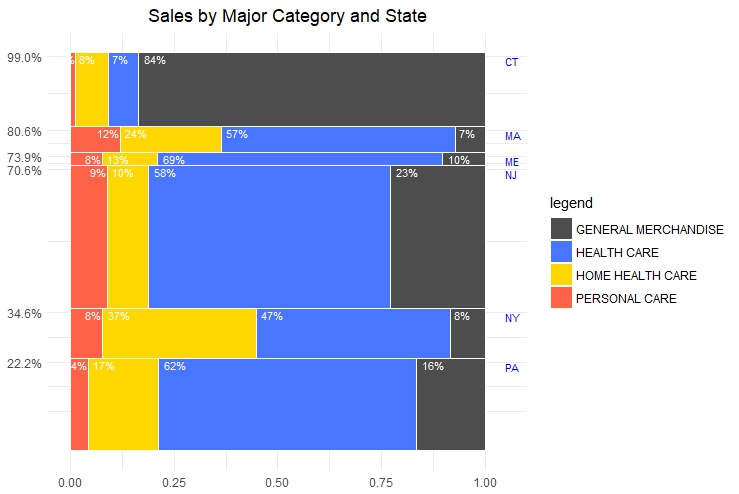
Mosaic plots or MariMekko plots are an alternative to bar plots . Traditional bar plots have categories on one axis and quantities on the other. If we have 2 categories we would normally use multiple bar plots to display the data. With mosaic plots, the dimensions on both the x and y axis vary in order to reflect the different proportions. Consider a hypothetical company with sales across the USA. Sales can be categorized by state and by product category. We would typically use multiple bar charts to represent the data.
Data
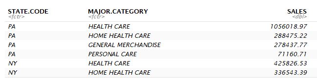
The sales data can be split along 2 categories: State and Major Category. State has 6 levels - CT, MA, ME, NJ, NY, PA while Major Category has 4 - General Merchandise, Health Care, Home Health Care and Personal Care.
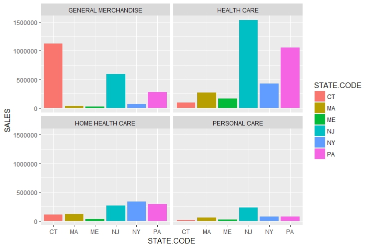
Bar Plots
We display multiple barplots by category the facet_wrap function from ggplot2
library(tidyr)
library(ggplot2)
data<-read.csv('Pharmacy_sales.csv')

ggplot(data,aes(x=STATE.CODE,y=SALES,fill=STATE.CODE))+
  geom_bar(stat="identity")+
  facet_wrap(~MAJOR.CATEGORY,nrow=2,ncol=2)
Alternatively we can stack the bars. ggpplot2 does this by default, but we need to remember to set the stat argument to “identity” within geom_bar
ggplot(data,aes(x=STATE.CODE,y=SALES,fill=MAJOR.CATEGORY))+
  geom_bar(stat="identity")
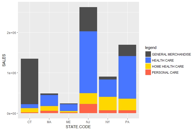
The stacked bar plots allow easy comparison across states but comparing across major categories is more difficult.
Mosaic plots
Mosaic plots allow us to visualize the both State and Product Category with one plot. However we do lose information about the absolute number of Sales. Instead we are able to compare across categories. To create a mosaic plot using base ggplot2, we would need to compute the respective x and y values for each rectangle. We represent states along the y-axis and Product Categories along the x-axis. We calculate the respective xmin, xmax, ymin and ymax of the by grouping by Product Categories and States.
data_mosaic <-data %>% group_by(STATE.CODE) %>%
  mutate(
    share = SALES / sum(SALES),
    tot_group = sum(SALES)
  ) %>% ungroup()

data_mosaic <-data_mosaic2 %>%
  group_by(MAJOR.CATEGORY) %>%
  arrange(desc(STATE.CODE)) %>%
  mutate(
    ymax = cumsum(tot_group) / sum(tot_group),
    ymin = (ymax - (tot_group/sum(tot_group)))
  ) %>% ungroup() %>%
  group_by(STATE.CODE) %>%
  arrange(desc(MAJOR.CATEGORY)) %>%
  mutate(xmax = cumsum(share), xmin = xmax - share) %>%
  ungroup() %>%
  arrange(MAJOR.CATEGORY)
After that we create the mosaic plot using the geom_rect function
ggplot(data_mosaic2) +
  geom_rect(aes(ymin = ymin, ymax = ymax, xmin = xmin, xmax = xmax, fill = MAJOR.CATEGORY),
   colour = "white", size = 0.2)+
  scale_fill_manual("legend", values = c("GENERAL MERCHANDISE" = "grey30",
  "HEALTH CARE" = "royalblue1", "HOME HEALTH CARE" = "gold","PERSONAL CARE"="tomato"))+
  theme_light()
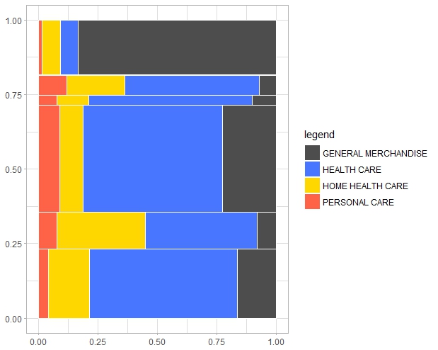
To improve readability we can label the states and indicate the percentage of each category on the plot. We do this with the geom_text function and the x and y coordinate data.
labels <- data_mosaic %>%
  filter(MAJOR.CATEGORY == "PERSONAL CARE") %>%
  mutate(y = ymax - 0.01, yRange = (ymax - ymin)* 100) %>%
  select(STATE.CODE, xmax, y, yRange) %>%
  ungroup()

value_labels <- data_mosaic %>%
  select(STATE.CODE, MAJOR.CATEGORY, xmin, xmax, ymax, share) %>%
  mutate(
    x = ifelse(MAJOR.CATEGORY == "PERSONAL CARE", xmax, xmin),
    y = ymax - 0.005,
    label = paste0(round(share * 100), "%"),
    hjust = ifelse(MAJOR.CATEGORY == "PERSONAL CARE", 1.05, -0.25)
  )
ggplot(data_mosaic2) +
  geom_rect(aes(ymin = ymin, ymax = ymax, xmin = xmin, xmax = xmax,
                fill = MAJOR.CATEGORY), colour = "white", size = 0.2)+
  scale_fill_manual("legend", values = c("GENERAL MERCHANDISE" = "grey30",
                                         "HEALTH CARE" = "royalblue1",
                                         "HOME HEALTH CARE" = "gold","PERSONAL CARE"="tomato"))+
  theme_light()+
  geom_text(
    data = labels,
    aes(x = 1.05, y = y, label = as.character(STATE.CODE)),
    hjust = 0, vjust = 1, colour = "blue",size=3
  ) +
  geom_text(
    data = value_labels,
    aes(x = x, y = y, label = label, hjust = hjust),
    vjust = 1, size = 3, alpha = 1, colour = "white"
  ) +
  scale_y_continuous( breaks = labels$y, limits = c(0, 1),
                      labels = scales::percent)+
  theme_minimal()+
  theme(axis.title=element_blank(),
        plot.title = element_text(hjust = 0.5))+
  ggtitle("Sales by Major Category and State")
The end result: