Chord Diagrams in R with chorddiag
This post is based on a previous project which can be found on this page.
Introduction
Chord Diagrams are a beautiful way of visualizing flows between various entities, for example trade and migration flows between nations. Sander and Abel used them effectively in their representation of global migration flows which was published in the Science Magazine. While their implementation uses javascript, it is possible to use R to produce interactive chord diagrams via the wrapper chorddiag by Matt Flor.
Data
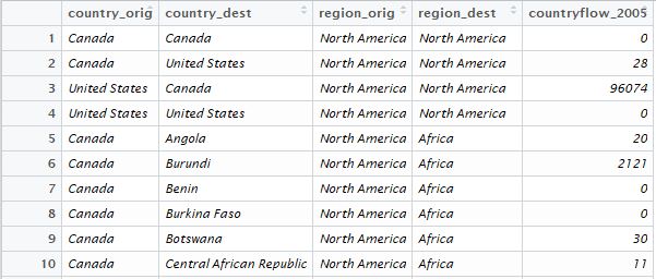
We will use the migration data available from http://www.global-migration.info/ . In this dataset, each row contains estimates of bilateral migration flows at region and country levels for 5-year periods (mid-year to mid-year): 1990-1995, 1995-2000, 2000-2005 and 2005-2010. After importing in the data we filter for country_orig,country_dest, region_orig,region_dest and countryflow_2005 (for migration flows in 2005-2010).
library(tidyverse)

mig_data <- read_csv("Data on the global flow of people_Version March2014.csv")
mig_data$region_orig <- as.factor(mig_data$region_orig)
mig_data$country_orig <- as.factor(mig_data$country_orig)
mig_data$region_dest <- as.factor(mig_data$region_dest)
mig_data$country_dest <- as.factor(mig_data$country_dest)

mig_data<-mig_data %>% select(country_orig, country_dest, region_orig, region_dest,countryflow_2005 )
The header of the dataset looks like this:
In order to use the chorddiag package, our data has to be in an adjacency matrix format. Each row or column represents a country and the entry for row i and column j would represent the flow from country i to country j. We use the as_adjacency_matrix and as_tbl_graph functions from igraph and tidygraph to convert our data into an adjacency matrix. Since bilateral flows are represented, this matrix is not symmetric. Visualizing all the countries would result in an overcrowded chord diagram. As such we filter by the flow of migrants or the regions to reduce the amount of data to be plotted. It is also possible to filter by region of origin or destination. Filtering should be done before converting the data into adjacency matrix form. In our chord diagram the filter is set to only show flows of 100k or above.
library(igraph)
library(tidygraph)

mig_data_filter<-mig_data %>% filter(countryflow_2005>=100000)
mig_data_filter<-as.matrix(as_adjacency_matrix(as_tbl_graph(mig_data_filter),attr = "countryflow_2005"))
Chord Diagrams
We can now use the chorddiag package to plot our data. The function chorddiag takes the adjacency matrix and produces a chord diagram. There are multiple parameters that can be set. These settings would need to be adjusted depending on the amount of flows to be displayed in order to avoid overcrowding of the chords or the labels. groupnamePadding, groupPadding and margin control the paddings and margins and should be used to increase the spacing between the various entities on the diagram. groupColors is set to a warm template in our case while showTicks is set to FALSE to avoid plotting the ticks which will crowd up our diagram. groupnameFontsize is adjusted to avoid country names overlapping or exceeding the plot margins. Since some country names are long it is also possible to use abbreviations to reduce the text length.
chord<-chorddiag(data = mig_data_filter,
groupnamePadding = 30,
groupPadding = 3,
groupColors = c("#ffffe5","#fff7bc","#fee391","#fec44f","#fe9929","#ec7014","#cc4c02","#8c2d04"),
groupnameFontsize = 13 ,
showTicks = FALSE,
margin=150,
tooltipGroupConnector = " ▶ ",
chordedgeColor = "#B3B6B7"
)
chord
We get the following chord diagram:
This html widget is interactive and allows the user to explore the data by hovering over the various chords and groups. We can further enhance the visualization by allowing the user to filter the number of migrants, the period of interest and the regions via shiny. For additional interactivity we have access to the user clicks via the parameters clickAction and clickGroupAction.